Project: ScottishPower Digital energy bills
ScottishPower wanted to build a more helpful digital bill solution for their customers.
Problems
Customers did not understand all of the data on their energy bill including how their account balance was calculated. This drove the highest volume of call-ins to customer service as the customer believed a verbal explanation was clearer than the bill design.
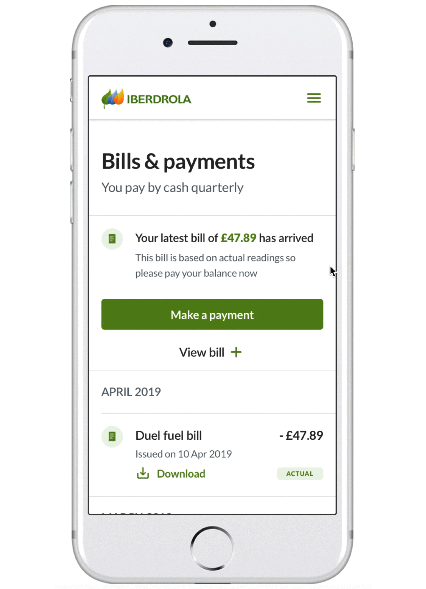
The bill was also in PDF format, which didn't allow for customer interaction to easily find out more information.
Who
The audience was online ScottishPower customers viewing their bills.
Goals
The primary goals were to make the bills easy for customers to understand and to reduce call-ins related to this matter.
My role
I was the lead UX and UI designer for this project: I gathered requirements, built wireframes and created the high fidelity designs.
Requirements gathering
I met with stakeholders to learn about the problems and to review features that needed to be included in the solution.
Additional, specific customer issues included:
- unsure of the next bill date and amount
- couldn't afford the bill and not sure what their options were for this situation
- unsure if the amount owing was actual or estimated
- didn't know how and if they could get a credit or refund
- unsure what type of payment plan they were on
- weren't sure how to get an actual owing amount
We also talked about common user experiences for different payment type customers. For example direct debit customers looked at the bill to ensure the amount and dates were accurate and also to check their energy usage. Quarterly customers looked at the amount, the due date, the usage and if it was an estimated or actual amount. Prepayment customers looked at past transactions, usage, and if it was an estimated or actual amount.
Research
I went through any existing user feedback I could find (from user interviews, workshops and contact centre feedback) as there wasn’t budget or time for new user research.
Some helpful feedback was that the copy was too technical for users to understand and that the design was too busy to easily find the information that they were looking for.
I also conducted competitor analysis and documented helpful patterns.
Wireframes
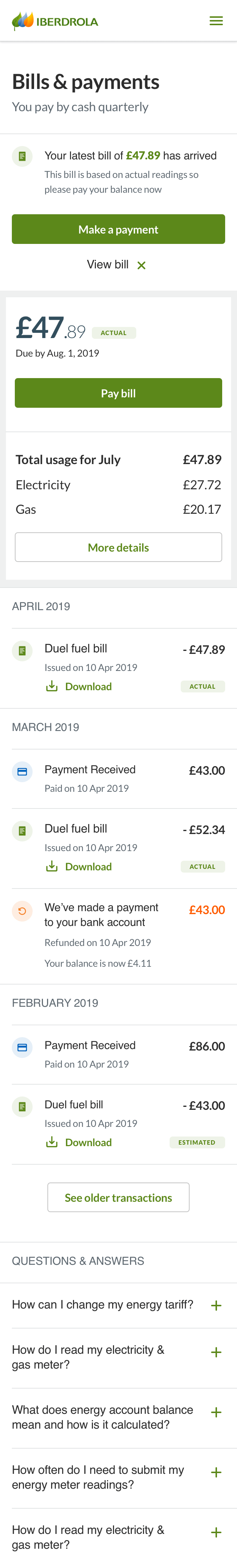
I created wireframes for the three different payment types: bills sent every quarter, bills taken by direct debit monthly, and bills paid by prepayment cards. There are also additional variables such as if the customer has a smart meter (we'd then know their exact owing amount) or if they’re in debt to ScottishPower. Because of all these factors, there had to be multiple variants of the designs in order to display information to the customer in the most relevant and helpful way.
For example, if we knew their exact amount owing, I put a label that said “actual” and if we didn't know the exact amount, then there was a label that read “estimated”. Clicking or hovering over these labels would tell the customer exactly what they meant. The designs also had different call to actions, depending on their needs, for example if they had to enter in their own meter readings, make a payment, change their direct debit amount or request a refund.
I also adjusted some of the copy from the original bills to make it more understandable (i.e. I changed "tariff" to "plan" and "this period" to using actual dates).
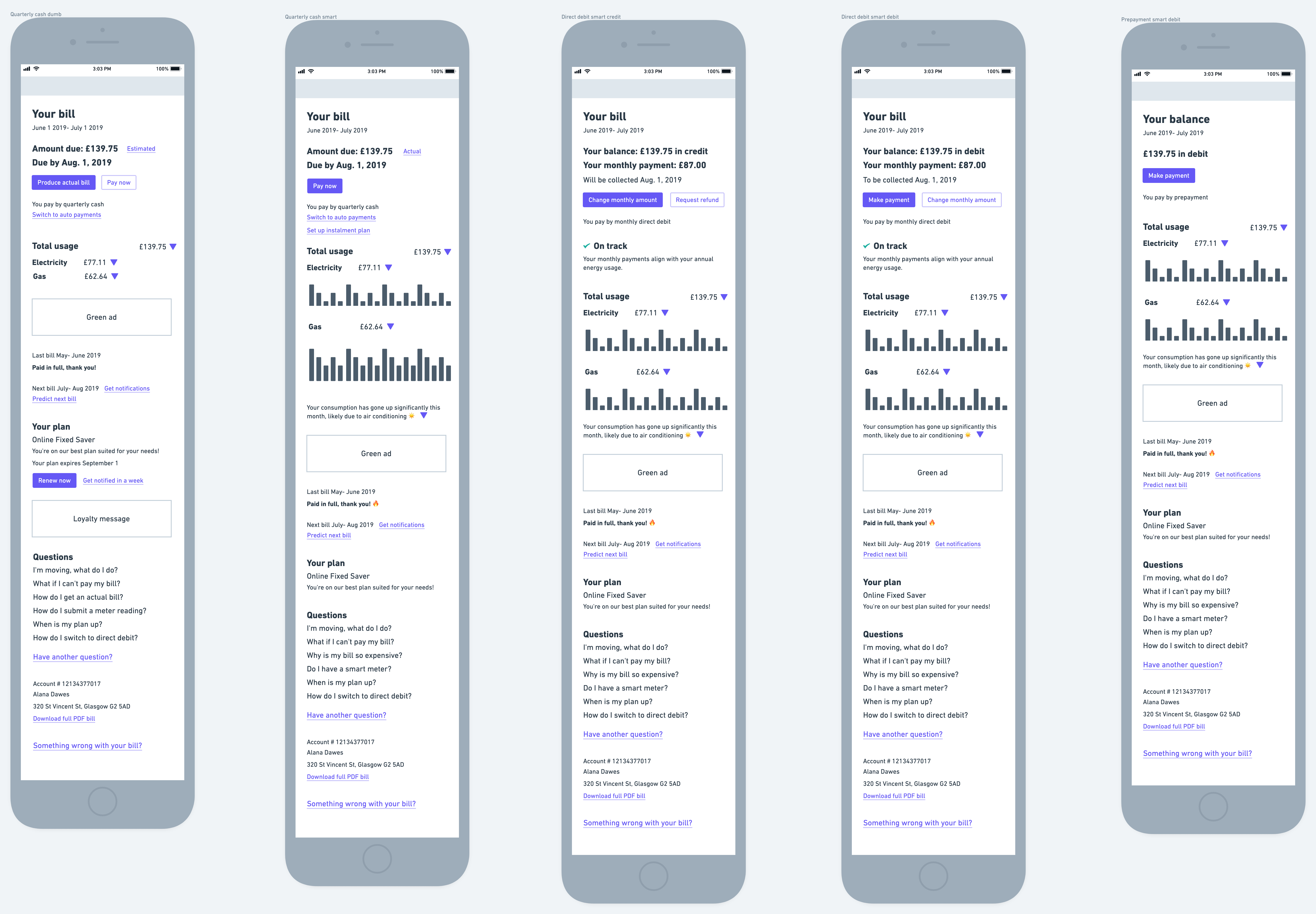
I also added options that were valuable for the customer and business like switching to auto payments and setting up an instalment plan if they owed money.
The feedback showed that customers liked feeling appreciated so I added a thank you message. They also wanted to learn about energy information so I added a section to share ScottishPower's green initiatives.
One of the biggest problems was that users were calling into the customer care line frequently to ask information about their bills that should have been obvious. In my design, if after the customer went through the digital bill screen and still didn’t understand it or had a question, I placed FAQs (specific to their payment type) near the bottom of the page. It contained links to get further help which would go to online help rather than directly to a call.
I also added some nice to have items such as insights on their consumption (for example sharing that their owed amount had gone up this month, perhaps because it was hotter and they were using air conditioning).
Check in
In speaking to the product owner, we decided to do the simplest rendition of the designs for the first release. The main aim was to give the client the information they needed in a clear and concise manner.
Design and prototype
I used our design toolkit to create high fidelity designs and prototypes.
I added a “View bill” link that would expand and hide more details as to where their bill amount came from. I also added a history of their previous payments so they could see previous amounts and what they had already paid.
Release
At my time of departure this feature was not yet released but the design solution strived to achieve the goals. Had I stayed at the company longer, I would have conducted usability testing to ensure the design answered the problems.
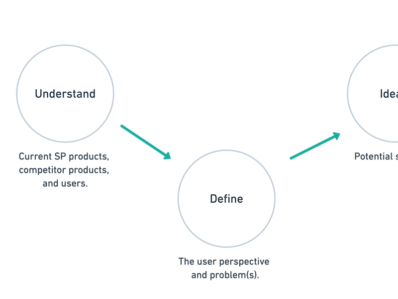
UX process
ScottishPower