Project: HSBC Appropriateness questionnaire
A solution for staff to provide appropriate product recommendations to customers.
Problem
HSBC needed a digital solution for staff to recommend the best products to customers based on their financial needs. This was in order to better serve customers and also to meet a new government mandate.
Who
The users were branch and contact centre staff who service customers.
Goals
The primary goal was to create a questionnaire for staff members to go through with customers that would produce appropriate product recommendations. Further goals included the need for clear copy and structure (which both new and experienced staff could understand), and a solution that was structured in a way that allowed for an easy and efficient conversation flow between the staff member and the customer.
Another goal I included for a better user experience was for the questionnaire to be as flexible as possible in terms of the ability to add and remove topics and to decline the questionnaire after it was already in progress. This would alleviate stress and time spent with the customer as the staff member wouldn't have to start a new questionnaire if topics needed to be changed or if the customer later decided to decline it.
My role
I was the lead UX designer: I gathered requirements, built wireframes, produced the user flow, created the high fidelity designs and copy, defined the interaction design, conducted focus group sessions and tested the built product.
Requirements gathering
I met with stakeholders to learn about the problem and to review the requirements (including the decision tree and the required questions).
Research
I conducted comparative analysis to explore different progress trackers to expand my knowledge of the best elements and patterns.
Wireframes
Because of the tight timelines, not all of the requirements were available at the beginning of the project. This meant I had to work on one section at a time without having the full details for all of the sections. I designed a questionnaire solution that I believed would be scalable while having unknown requirements.
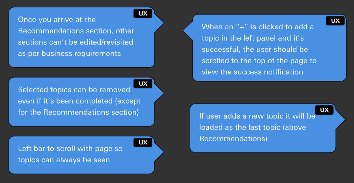
In the first screen, the user can choose from topics that the customer is interested in (such as "credit cards", "mortgages" or "savings"), or they can select that the customer has declined the questionnaire. I added descriptive text below each topic (approved by SMEs) to ensure the staff and customer are making the correct selections as some of the topics have overlapping themes.
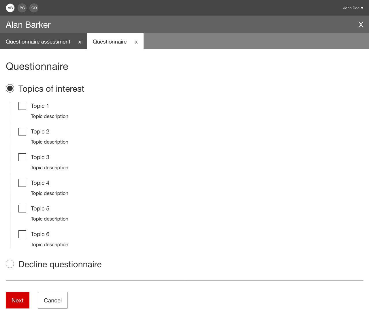
For the topics pages, I designed a progress tracker/topic selection on the left side for users to easily see where they are and to be able to add or remove topics based on their conversation with the customer. If the customer decides to decline the questionnaire during the conversation they can also do so via a button in the same panel.
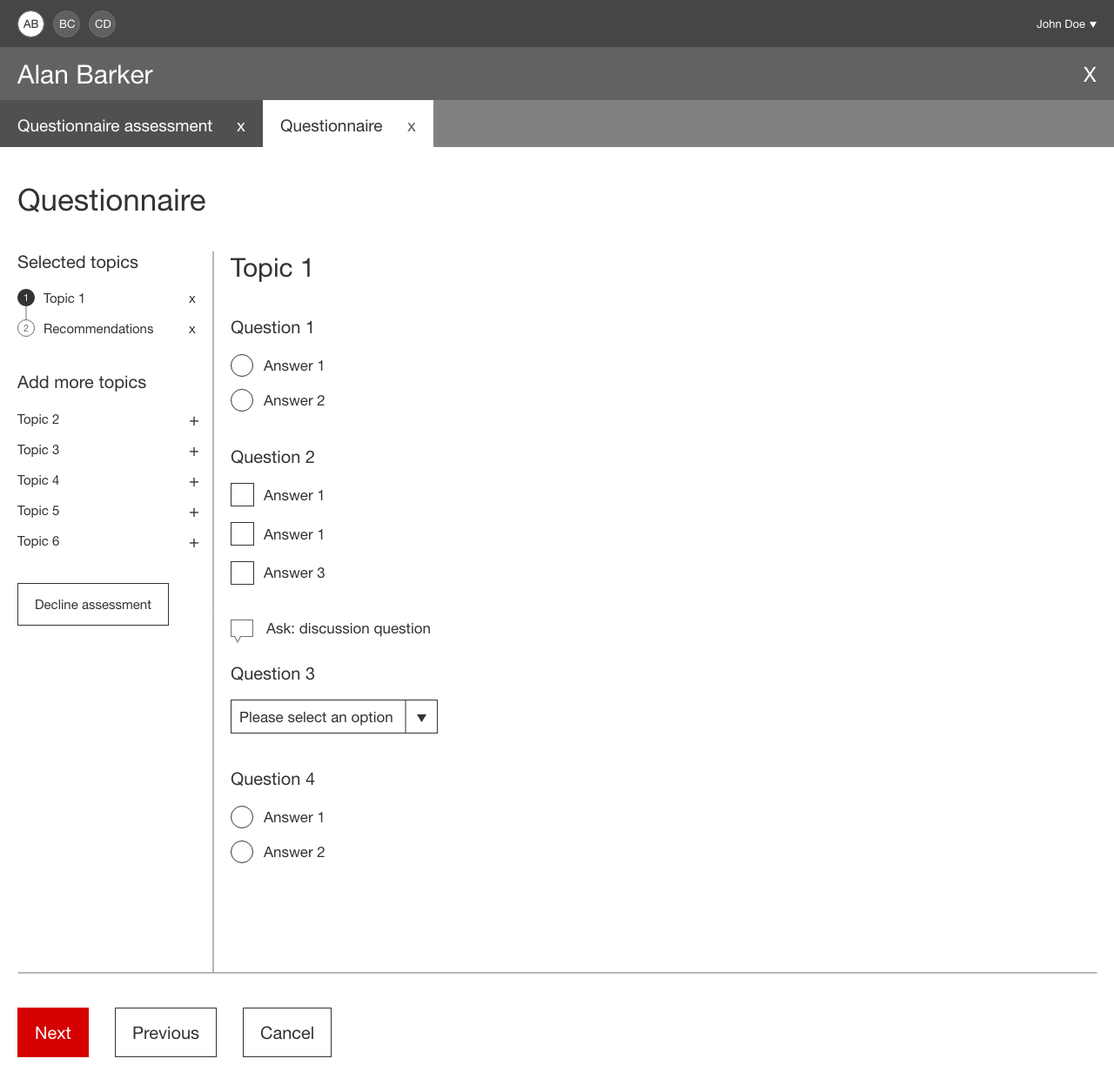
The questions live in the right section of the page. Some questions are conditional and appear once the user has chosen a specific answer in order to not overwhelm the user with unneeded content.
Design
Using existing components and elements I created thoughtful designs to make the questionnaire as efficient as possible to benefit both the staff member's and the customer's time.
Some copy was meant for the staff member to start a discussion with the customer to find out more information for understanding, and not to input any information. For these points I used a speech bubble icon to differentiate this text. This is something I'd like to test with users in the future to ensure it's intuitive. A benefit to designing for staff is that we can provide training seminars and documentation to explain how the features work. That being said, the main goal is to make the application as easy to understand as possible so that documentation isn't needed and so that serving the customer is enjoyable and efficient.
I also rewrote much of the copy that was provided to ensure it was easy to understand, consistent and efficient. All of the copy changes were reviewed by business and SMEs to confirm it was appropriate for staff users.
I had to be extremely agile as requirements (mainly question copy and structure) were often changed (especially with a large number of SMEs being shown the designs throughout the process). This impacted my focus and I carefully prioritized what I was working on to ensure deadlines and new changes were both met and passed onto developers in a helpful manner.
Because this is an internal app, I am not able to share the high fidelity designs including specific copy.
Tech and business walkthrough
I worked with the development team to ensure everything I designed was possible to build within the given timelines. Throughout the process, limitations came up such as how the user could navigate through the questionnaire and I worked to adjust the designs based on these constraints as well as the timelines and business requirements.
During the walkthrough, I shared experience details which I documented as annotations in the user flows for the team to easily reference later.
I worked closely with the business team to implement requested copy and structure changes while communicating which visual feedback wasn't possible when adherence of design guidelines was needed.
Usability testing
Time was limited for this project and there were also a large number of SMEs needed to review the design as many groups were affected (for bank accounts, mortgages, investing, etc.). This allowed me to present the flow to specific groups in various meetings (one group per presentation) to receive feedback. I received positive feedback for the look and feel and plan to do usability testing when time allows in the future.
QA testing
After each page was built I would test them against the design guidelines. Upon discovering defects I would prioritize them based on if they were a visual or functional defect and its severity. This was to help both developers and business know the importance of each defect as timelines were tight.
Release
At the time of writing this, the release is not yet complete. Aside from the launch, the goals were met. The questionnaire was designed and built with appropriate product recommendations. The copy and structure was signed off by SMEs to ensure that it is intuitive for staff, and the user is able to add and/or remove topics throughout the journey or decline if the customer wishes.
Digital energy bills
ScottishPower
UX process
ScottishPower