Project: ATB Online banking website redesign
ATB Online serves as an online banking platform for ATB customers.
Problem
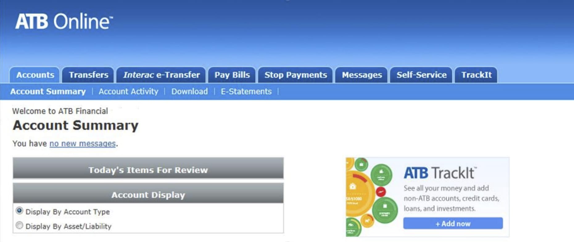
ATB Online had an outdated design and a less than perfect online banking experience. It needed a design refresh to make it easier to use. An expense management tool called TrackIt also needed to be integrated into the main accounts page.
Who
This banking platform is used by ATB Online customers using the desktop website.
My role
I worked as the lead digital designer alongside business analysts, developers, copywriters, and an external UX team.
It was my responsibility to design high fidelity mock ups, consult on design and branding to an external vendor, update the redesign team on a weekly basis, and to keep my internal design team in the loop.
Wireframes, research and design
I was brought in after an external company had completed wireframes. I performed competitor analysis to look for design and online banking experience inspiration.
Using the wireframes as a base, and using the inspiration from my research, I worked on the visual design of the main pages. As we were in the middle of a new company rebrand I also worked with the creative director to ensure this site would reflect the new styling.
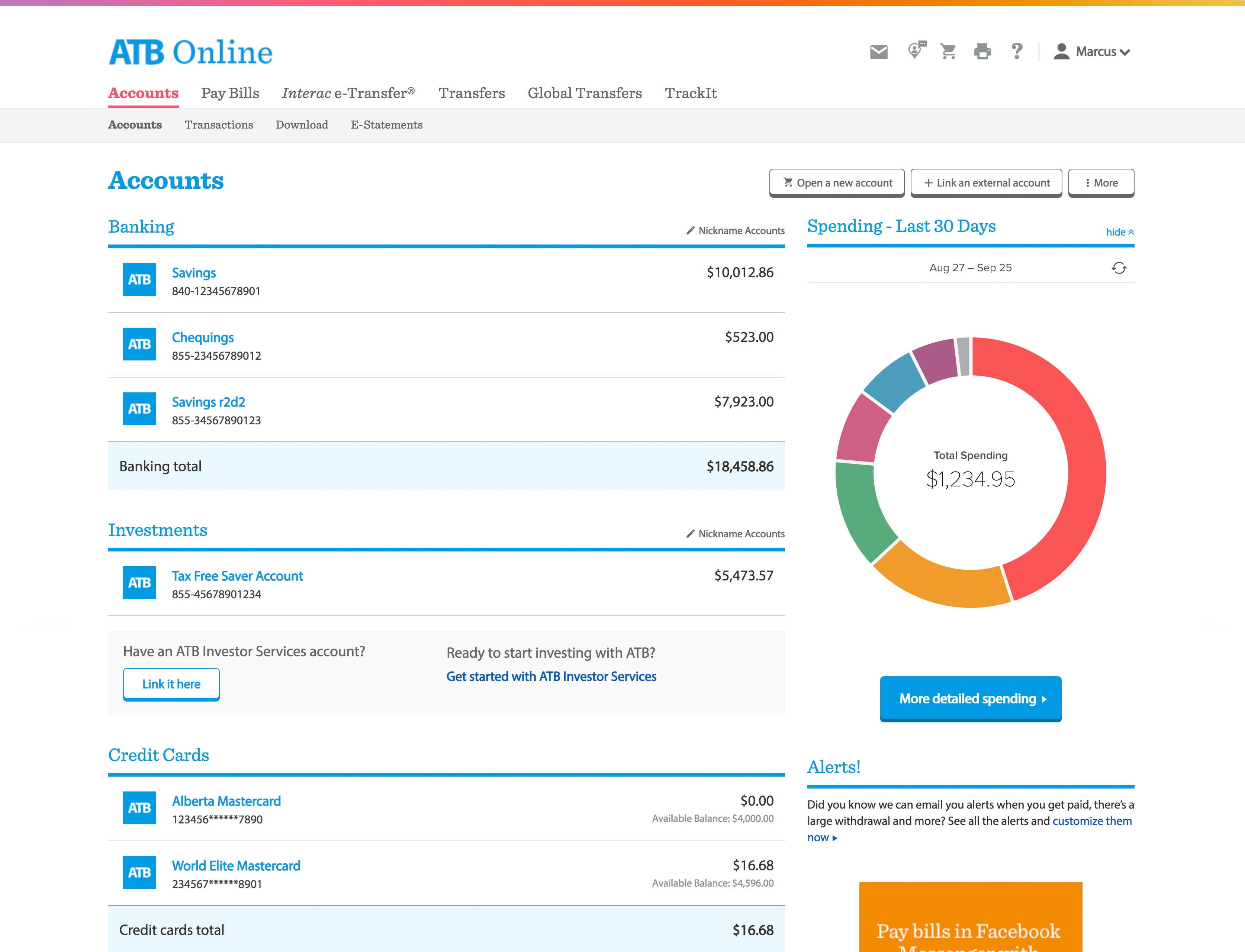
I used different colours for the different sections (and navigation items) so that users could use the colours to quickly identify where they wanted to go and where they were. It was important that I used white space and font sizes to the user's advantage so that they could clearly see the data they needed to see and to be able to easily execute the actions that they needed to.

The external team took my designs and applied them to secondary pages which I then reviewed and gave feedback on.
Prototype and test
From there, the external team created prototypes and performed user testing with both customers and non-customers.
One observation was that although customers knew the transactions section contained past transactions, they still looked for transfer history in the transfers section first. To solve this, we added a link directly to the page navigation to view past transfers.

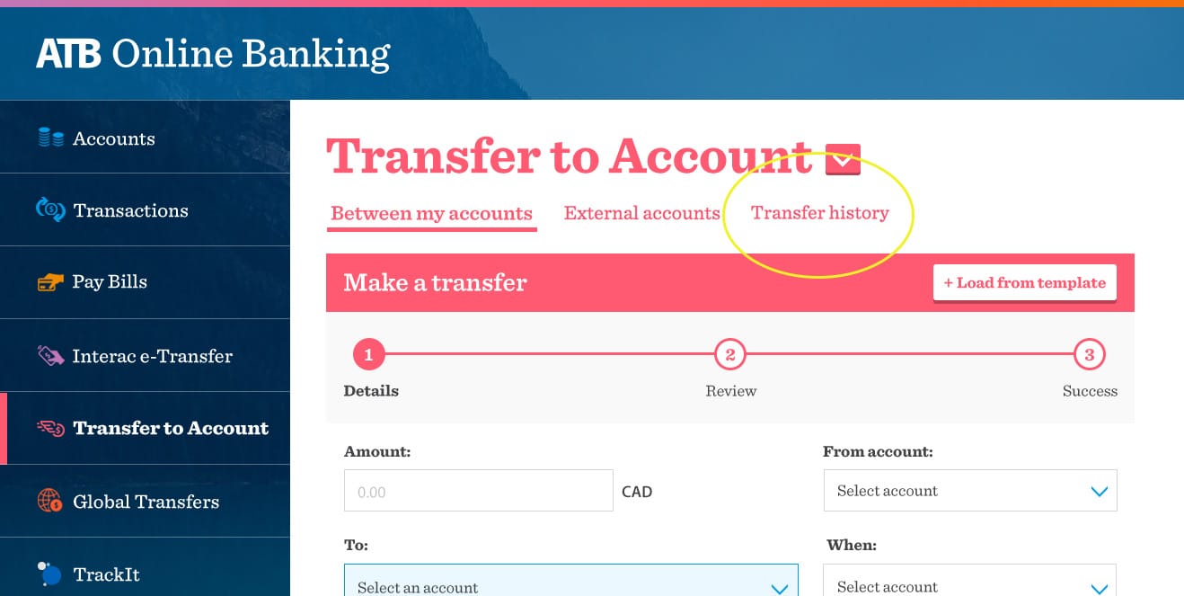
Unfortunately due to budget constraints, the backend platform update was no longer in scope. Because of this, we had to use the original framework and adjust the design layout to match. I was able to do this and keep the updated styling. With the new layout we also went for a lighter styling for a brighter, more spacious header and navigation area.
Once the high fidelity mocks were completed and signed off, I worked with the developers to ensure the designs were translated correctly and to make sure that element styling was consistent across the site.
Solution
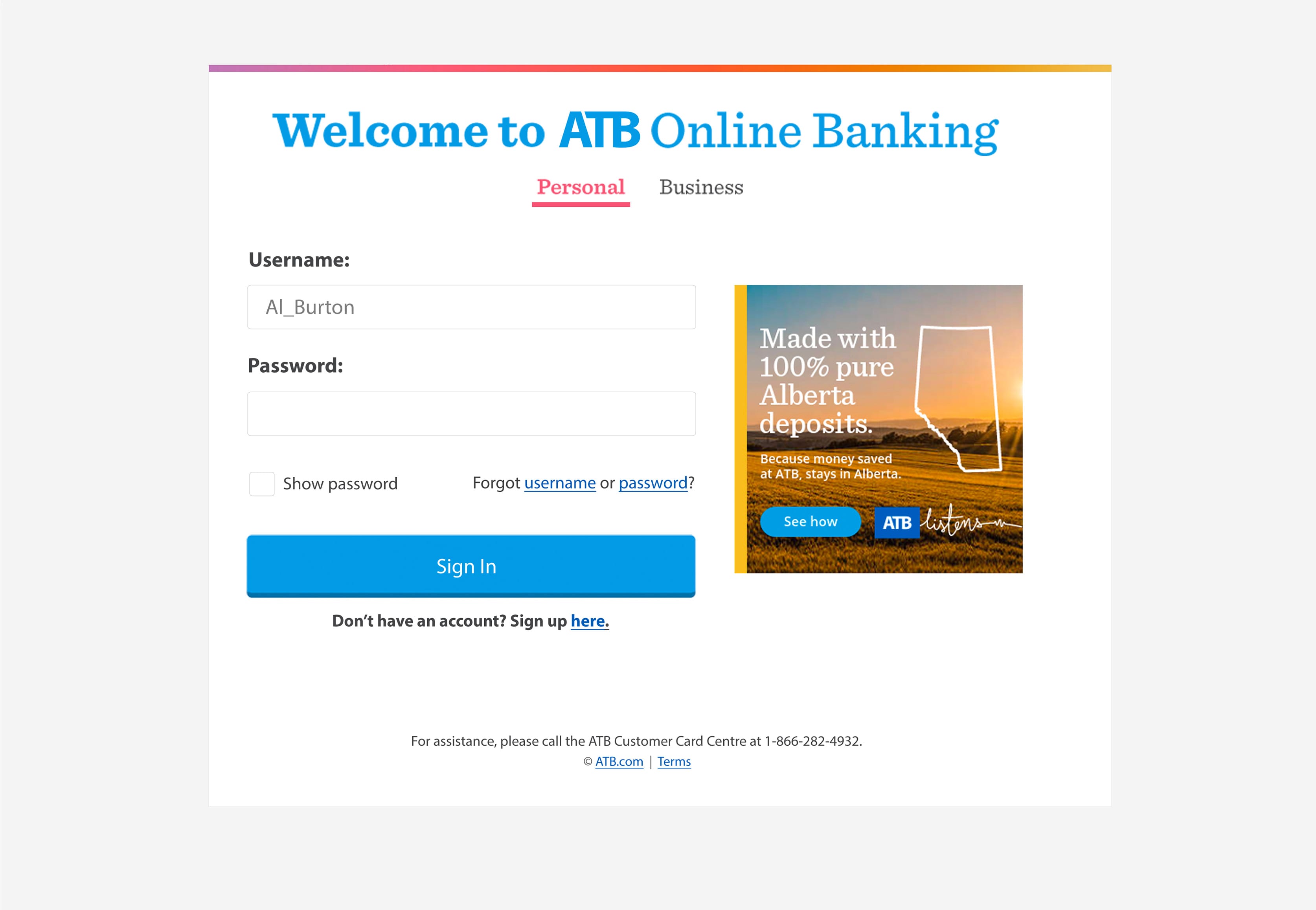
The final product had a bright and friendly style, along with larger text and more accessible links and actions to allow customers to easily do the online banking that they needed to do.
Learnings
There were a lot of learnings in this project. I learned more about communication with external vendors and what they need to succeed including timelines, feedback, styling rules, and overall, great communication.
Communication is a big part of success and this project taught this- the more everyone was in the loop, the more accurate expectations were, and the happier people were. This also helped people organize their timelines to meet deadlines.
Once online, we learned some brand colours didn't comply with World Wide Web Consortium's colour contrast ratio guidelines when a visually disabled user was unable to read our blue text. I adjusted the brand colours to adhere to these guidelines which translated into the brand guide, benefiting all future digital ATB projects.

There are always unexpected changes and with the layout changing well into the project it taught me to always be agile- to always be ready to adjust in any circumstance based on business, user, or development findings.
