Project: ScottishPower YourEnergy quote redesign
This was a project I worked on during the application process for a job at ScottishPower. I noticed a page where the experience wasn't ideal and worked on a design solution.
ScottishPower is an energy provider company and the targeted users were customers using their website to get an online energy quote.
Problem
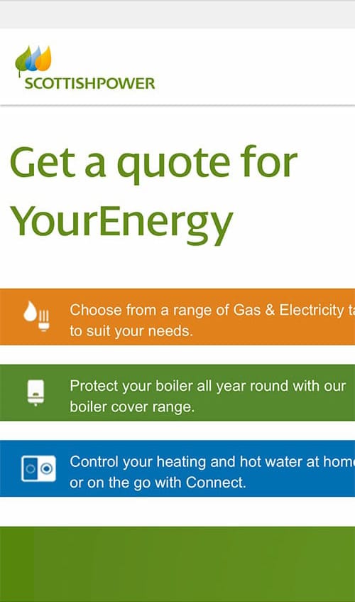
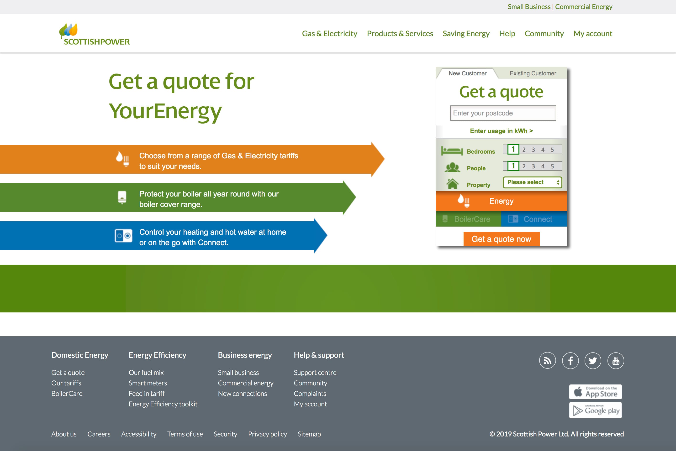
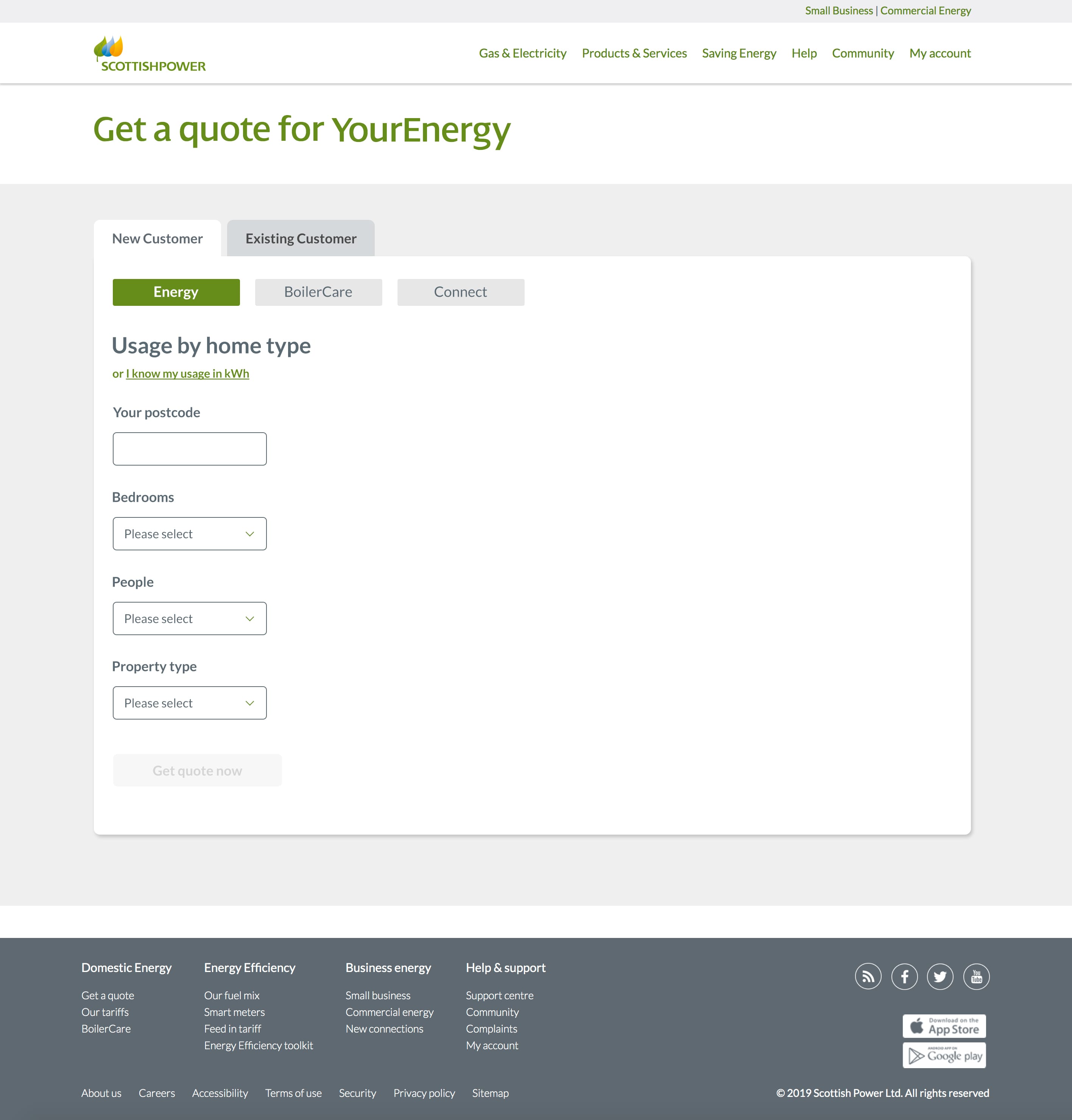
While looking on the SP website at the “Get a quote for YourEnergy” page, I noticed there was one definite user problem and another problem that I had (and could be assumed is a problem for others). The first problem was that the page wasn’t mobile friendly- you could only see the left area of the page and had to side scroll to see the action/form area. The second problem was that the hierarchy in the form was confusing- why was the selector for the type of quote (Energy, BoilerCare, Connect) at the bottom of the form rather than on top? This may have been a solution to testing, but in case it wasn’t, I wanted to explore it.
My role
As a UX designer, I did some research, defined the user, and created a design solution from these findings.
Scope and constraints
I was limited in time and data so I made some assumptions in the user data to help guide the process.
Research
I researched the quote process to see how it was normally done as well as the styles used by the rest of the ScottishPower website to see how they could be applied to the new design.
Who and what
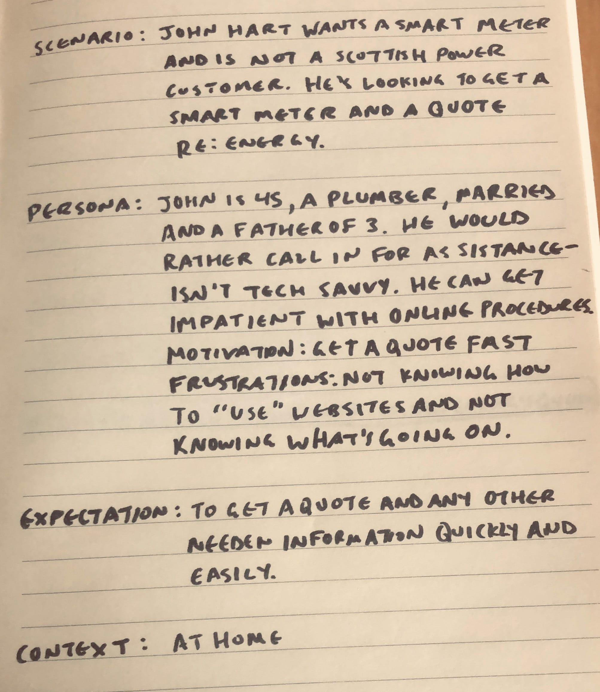
To better understand the users, I made a persona to help. John Hart wants a smart meter (a device that measures energy consumption) and is currently not a ScottishPower customer. He’s looking to get a smart meter as well as an energy quote.
John is 45, a plumber, married, and a father of 3. He would rather call in for assistance- he isn’t tech savvy. He can get impatient with online procedures. His motivation to use the website is to get a quote faster. His frustrations include: not knowing how to use websites well and often not knowing what’s going on while he's using technology. He’s using his phone at home to access the website.
John’s expectation is to get a quote and any other needed information about the smart meter quickly and easily without having to call in.
The journey
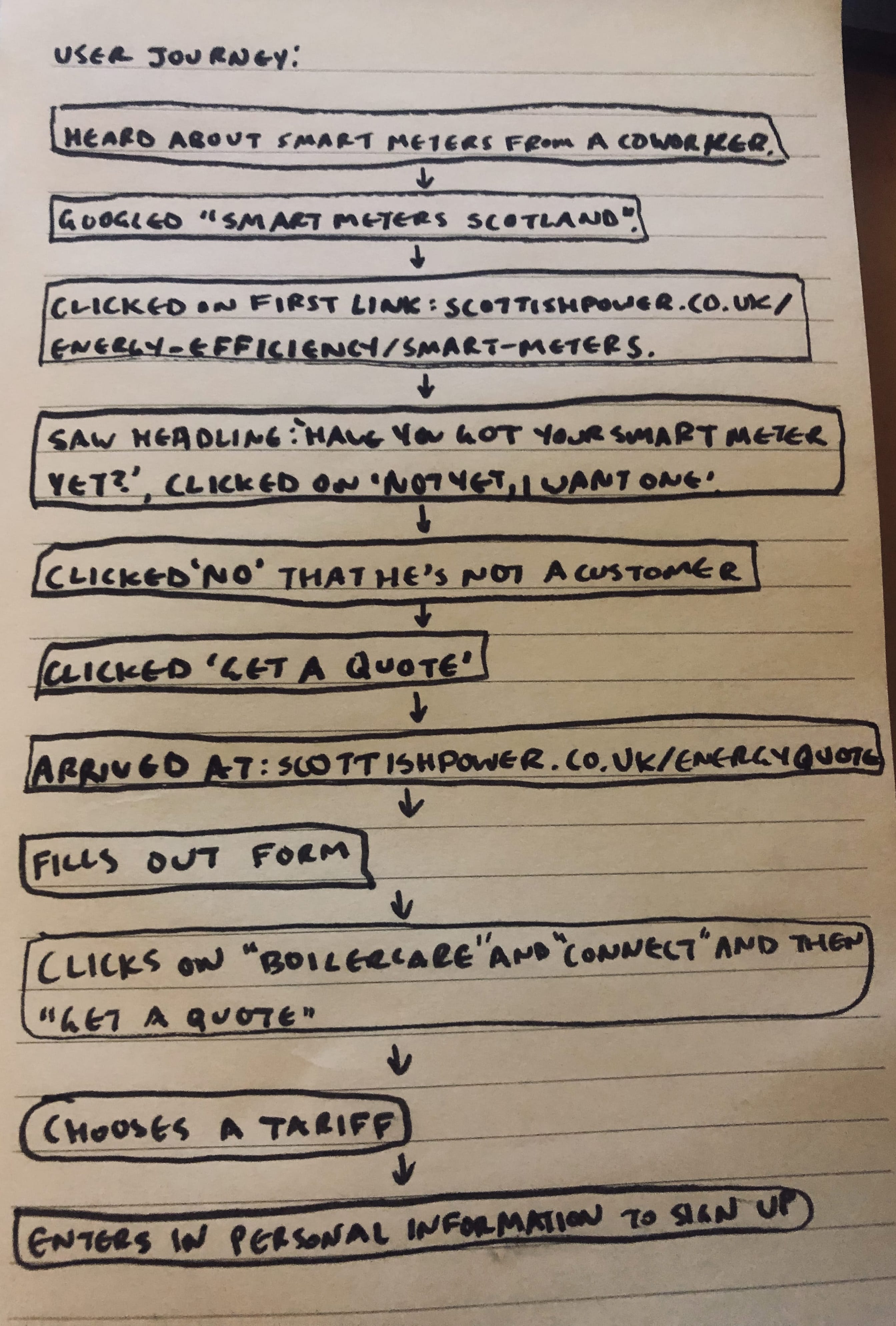
Here’s what John’s user journey looks like:
- Heard about smart meters from a coworker.
- Googled “smart meters Scotland”.
- Clicked on the first link: scottishpower.co.uk/energy-efficiency/smart-meters*.
- Read headline “Have you got your smart meter yet?” and clicked on the button below it that read “Not yet, I want one”. John is feeling optimistic.
- Read the next headline “Thanks for your interest in smart meters. Are you a ScottishPower customer?” and clicked on the button below it that read “No”. He’s starting to feel anxious.
- Read the next headline “To register your smart interest, you currently need to be a ScottishPower customer” and clicked on the button below it that read “Get a Quote”. He’s feeling optimistic again.
- Arrives at the “Get a quote for YourEnergy” page. Sees all the text on the left side but not the arrows. He’s feeling confused as to how to get a quote. Eventually tries to scroll to the right as he notices the text in the coloured bars are cut off.
- Starts to fill out the form and then gets to the Energy, BoilerCare, and Connect options. He feels a bit confused and distracted.
- After clicking on “BoilerCare” and “Connect” he clicks on “Energy” again and the “Get a quote now” button. He feels frustrated with how long the process is taking.
- Chooses an energy tariff on the next page. He’s feeling hopeful.
- He then enters in personal information to sign up.
*Note: this page's design has since been updated.
Solution
Because of the time constraints I looked at the "Get a quote for YourEnergy" page rather than the entire process. Based on the above, I knew I needed to adapt the design to be responsive on mobile, to be quick and easy to use for all ages and technical abilities, and to be similar to other sections of the website for consistency’s sake.
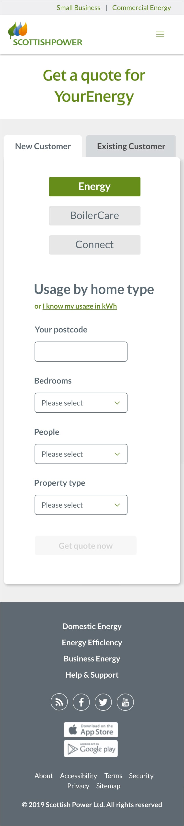
Looking at the layout I knew I needed to move the actionable area front and centre for the user to easily see and fill out the form on all devices. I moved the form to the left and removed the Energy, BoilerCare, and Connect descriptions- these can be put on their respective sections. The "New Customer" and "Existing Customer" tabs are bigger, easier to read and the tab UI styling is reused from an existing SP page.
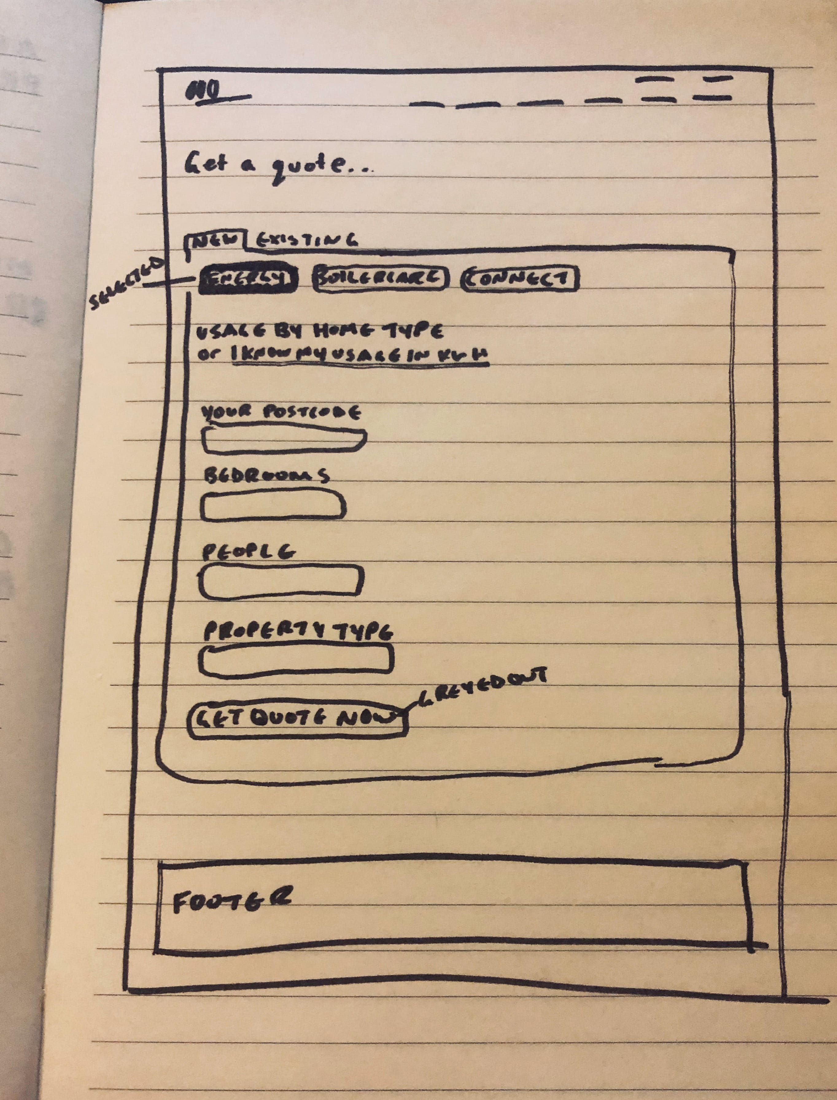
To alleviate confusion, distraction, and loss of flow I moved the Energy, BoilerCare, and Connect buttons to the top of the form allowing the user to choose their quote type before filling out the form. I’ve changed the second title from “Get a quote” to “Usage by home type”. “Get a quote” is already at the top of the page and this also allows us to explain to the user that they’re receiving a quote based on usage by their home type. Also, if they want to instead, there’s an option directly below to click a link to enter in their usage in kWh. I changed the text from “Enter usage in kWh” to “or I know my usage in kWh” to hint that the user will fill in either the usage by their home type or by kWh, and that they need to know the kWh value to use that option.
The Energy, BoilerCare, and Connect button pattern is mostly taken from another SP page but I’ve proposed to use rounded corners to be consistent with other buttons and clickable elements. The postcode input label now reads “Your postcode” rather than “Enter your postcode” as the ask of entering data is obvious in a form and the label is now outside of the input box so the user can still see it as they’re typing. As well, I’ve kept most of the design of the elements on the page consistent with other SP pages.
The bedroom and people selection is now in dropdown format for graceful degradation to smaller viewport widths, and to not interfere if other elements were to be added to the right of the form.
The user
A lot of assumptions were made about the user’s needs. This project was more to show a few parts of the UX process I hadn’t shared before as well as some visual design. If this was an actual project, what else would I like to do aside from using actual data and business requirements? Test! I would like to test the entire journey from start to finish. I would like to test if users need an explanation for Energy, BoilerCare, and Connect and where they’d need that displayed. I would like to test if BoilerCare, and Connect belong on this page. I would like to test if it’s helpful to have colours and icons for Energy, BoilerCare, Connect, and for the different input sections. I would like to test if the tabs will fit on mobile or if they should degrade nicely into a dropdown element. I would like to test if step indicators would be helpful.
Once again, this is not a comprehensive process or solution, but a short exercise to give some insight into my capabilities. Overall, the design is clear and concise with the ability to easily respond to other viewport sizes answering the problems as strategically as possible with no user data.